Jenks Brands
←BACK


A new fully custom structure and experience e-commerce for a UK producer and seller of healthy snack food products. This e-commerce, with its easy management dashboard and direct integrations with fulfilment, allows this UK Business with more than 70k existing customers to be fully automated.
General Info
client name // JenksBrands
starting year // 2019
role // Lead Product Designer
responsibilities // Overseeing the full product lifecycle from discovery to live. Hands-on work in discovery and design phases and leading work on testing and development planning.
Constraint & Timeline
- E-commerce custom structure to allow online and offline transactions
- Fully integrated with fulfilment and self managable
Client
Jenks Brands is a UK producer and seller of healthy snacks made with natural ingredients with a strong position on why they say no to palm oil. They have a focus on small local shop, whilst also selling to some big supermarket chains and direct to consumers as well.
Brief
Create a new attractive e-commerce for both businesses and consumers with full business admin capabilities. Furthermore, new branding was needed and required to be used to deliver the Jenks Brands message.
Initial Plan
When I started to understand the requirements for this project the client was already working on this business by selling in person to businesses and with a small percentage of consumers buying from a self-made Shopify e-commerce.
Because this e-commerce website needed to have advanced business admin capabilities, to basically allow the owner to manage the whole business by himself, I had to review his current practises understanding his future needs.
Furthermore, I needed to clarify the current customers of this business and the future targets for this e-commerce. Understood the target I had to understand the tasks that they needed to complete on the website considering both business and consumer buyers, comparing them also with market and product competitors.
After this understanding I was able to proceed to a wireframe stage to define all the features required and the basic structure of the website, also considering security requirements to handle customer’s personal and payment info.
I was then planning to define the branding of JenksBrands and to use that to create an interactive mockup, to get client sign off for both and go over the front and back-end development.
Discovery
To create a solution I always start from the why so from understanding the key areas as much as I can. I do this at the beginning of every project during the discovery phase.
To get a proper picture of the requirements for this website I started by understanding and defining the main goals, and the key metrics to track.
Discovery / current business, market, payments
/ current data /
To start I reviewed the current database of active and inactive clients (which I already knew from the client’s brief was meant to be converted into e-commerce users), to understand the types of users in percentage (business or consumer), their normal amount of orders and frequency, their current preferred payment methods, their common requests to the business owner as well as the business managing methods and practises.
/ competitors /
To better understand the market, and its users, I researched and studied competitor brands (same products), similar businesses (same market) alongside successful and unsuccessful e-commerce with similar goals.
/ user data-flow /
To define the user data flow, particularly related to payment information, I worked with the data from the current customers and the requirements given by the clients. I identified the payment methods in cash, card and invoice. Then I studied the available options from payment handler Stripe and, working with the developers, I combined their API data flow with the product data and user flow. With these, I created the first version of the User Data Flow, User Payment Flow and Payment Logics Flow.
” …With these, I created the first version of the User Data Flow, User Payment Flow and Payment Logics Flow. “
” …With these, I created the first version of the User Data Flow, User Payment Flow and Payment Logics Flow. “
/ business workflow and tools /
To understand and define the structure of the admin dashboard, I worked with the client.
This allowed me to see not only his current digital and analogue practices but also the pro and cons of them. I was also able to study and use his current workflows and tools for both the online and offline sales (as they were both going to be integrated into this new site).
With this understanding, I was later able to simplify and streamline some of the existing practices (aligning them to the new functions of the website) and to adapt or convert them, to a new cohesive digital workflow (later tested and presented in the form of an interactive wireframe).
Discovery / Users
With these initial data and knowledge, I started to evaluate and test a selection of possible hierarchy for the website content and main users tasks, JTBD and personas connected to them. In particular, to validate hierarchy assumptions and to find possible issues or grey areas, I started to understand the differences between a business user flow and a consumer user flow, considering for both of them also the connected admin user flow.

Paul
Age // 50
Gender // male
Business – Consumer // Business – small local shop owner
How often does he need to order // Weekly
Pain Points //
Paul needs to make weekly orders to balance stock and demand.
Paul is focused on good cash flow, so he wants to pay in 30/60 days.
Needs //
Easy and quick ways to the products he sells when he needs them
JTBD //
When my stock is low I want to effortlessly refill it so I can sell more products and have just the stock I need.
When I buy products for my business I want to be able to pay with invoice so I can manage more easily my cash flow

Meghan
Age // 45
Gender // female
Business – Consumer // Business – Multi-store Supermarket store manager
How often does she need to order // Weekly
Pain Points //
Meghan wants quality UK made products for her store (even if it is part of a multi-store chain), however, she needs the simplicity and reliability of to order them like ordering industrial products.
Meghan wants quality UK made products but she needs to comply with the payment methods approved by the company.
Needs //
Meghan needs quality UK made products that can be easily purchased and delivered.
JTBD //
When I choose which products to add in stock I want to find quality UK made products that can be reliably delivered so I can provide good products to my customers consistently.
When I propose to my manager which products to add in stock I want to find quality UK made products from companies that meet the approved payment methods soo I can more easily get them approved to sell them in my store.

Jenny
Age // 25
Gender // female
Business – Consumer // Consumer – Freelance Yoga Trainer
How often does she need to order // Weekly
Pain Points //
Jenny wants quick snacks but she does want them to be healthy.
Jenny wants to recommend good products to her students but she needs something that is affordable too.
Needs //
Healthy snacks for her and her students.
Affordable snacks to eat and sell.
JTBD //
When I need to eat quickly I want to have quality products so I can keep healthy.
When I suggest or sell something to my students I want to give them quality products for a good price so I can make then feel good and make money.

Marcus
Age // 35
Gender // male
Business – Consumer // Consumer – Accountant with a passion for Running
How often does he need to order // Monthly
Pain Points //
Marcus has little time so he sometimes eats snacks, but he wants them to be healthy.
Marcus does have a food budget to respect, but he cares for quality.
Needs //
Quick healthy affordable snacks
JTBD //
When II need to eat quickly I want to have quality products so I can keep healthy
When I choose my food I want to find products with good quality at a reasonable price so I can eat well while still staying in my budget
Discovery / results
- Goals
- Create an e-commerce custom experience direct to B2B and open to B2C
- Structure the e-commerce to be easily managed by one person
- Support online and offline sales (and payments)
- Integrate with a fulfilment partner
- Targets
- Businesses
- Focus on small local shops
- Pro – consumers
- Key Metrics to track:
- Steps to place an order
- Quantity of tools to manage the business
- Amount of repeated orders
- The full definition of required managing methods
Discovery / wireframe
/ user /
To define the initial structure, using all the knowledge gathered, I started from the common elements of the e-commerce (shop page, product page, basket and checkout), then I added the custom elements required to meet the specific user and business needs. When the e-commerce user side initial structure was completed I moved to the business side.
/ admin /
To structure the admin side I considered, again, first the common e-commerce elements, starting from the structure defined for the user, I applied the extra features related to the specific business-admin flow (like impersonating a user to make an order on their behalf or to support). Then with the key metrics studied before, compared and combined with the standard e-commerce metrics and the existing business workflow practises, I created the map for the management dashboard. After a few rounds of optimisation and simplification (to provide only what was needed with no superfluous or redundant information) I combined them into their wireframe structure.
” … I started to create a structure of the product in a wireframe form, beginning from an initial site map.”
” … e-commerce user side initial structure…”
” …the admin side… wireframe structure.”
Discovery / Branding
Using the gathered knowledge regarding the industry and his competitors, as well as the user target information, and combining these with the current single products Branding, I created a cohesive Brand Design System to market all the different products and brands under the ‘JenksBrands’ brand and to create a shared marketplace for all of them.
Shapes connected to the Natural world are obviously organic, so they had a harmonious soft structure. All the 3 existing JenksBrands had naturally made products ( this was one of their strength and selling points) and each brand image was coherent in the shapes and colours with this product strength; they were consistent in this overall theme whilst still keeping their own identity.
“All the 3 existing JenksBrands had naturally made products… and each brand image was coherent in the shapes and colours …“
So I took the key elements and colours from the four sub-brands and I combined them to one cohesive brand identity, also updating and improving each sub-brand. The new JenksBrands logo itself followed the same criteria of harmonious softness, simplicity and connection to nature of the sub Brands.
” The new JenksBrands logo itself followed the same criteria of harmonious softness, simplicity and connection to nature of the sub Brands. “
” … also updating and improving each sub-brand. “
Prototype / UI
When the wireframe, and so the structural foundation of the product, have been tested by user testers, engineers and the client, and once it was approved, I was able to move in the next step of the process creating a mobile-first UI.
I first considered which elements were present on the tested wireframe, then, using the Branding created before, I defined a hierarchy of colours and shapes. With these, I created first the main building blocks of the UI (such as buttons, headers, dropdowns, text headings etc.). Once the main elements were ready I worked page by page, following the wireframe, creating the mobile UI of both the user and the admin sides of the product.
I then made an interactive prototype, of the mobile version, using Invision and principle, to test this UI with users and engineers and finally to get approval from the client.
With the mobile UI fully tested and approved, I moved from narrow to wide creating the tablet and desktop UI versions the product. This UI then went through the same testing process described above.
With the full UI, presented in an interactive prototype, I defined and ran an internal user testing with a controlled group of 20 people. Using the feedback gathered I made the needed adjustments and got the final approval from the client to move to the development phase.
User side full prototype
Admin side full prototype
Development
With a clear structure, a defined UI, interactive prototypes, and comprehensive data flow and user flow, I started to work closely with the engineers. Thanks to these resources, the product was clear, and everyone knew exactly what to do.
During the build, I use my full understanding of the product, and my technical understanding, to support the developers to find solutions and make adjustments when needed.
Front-end
The Build started from the desktop front-end development. During this, I helped by providing detailed and specific material (like existing prototypes for specific pages, flows, micro-interaction animations etc.) and by testing the solutions during the building process.
Once the fully-responsive front-end was completed, I organised and also took part in the full testing on every supported device and browser. When all the feedback from this was implemented, I simultaneously ran a user usability testing, providing a specific task to the users (for both user and admin side), and provided the front-end to the client to test (and show progresses).
Back-end
With the front-end completed, I again worked closely with the developers in building the back-end to make sure that all the functionalities were built according to specs, providing specific user and data flow when needed as well as helping them finding solutions where any agreed flow or functionality wasn’t working as expected of fully feasible to build.
As I did for the front-end development, here as well I organised and ran testing throughout the back-end development and final testing on all devices and browsers.
Content
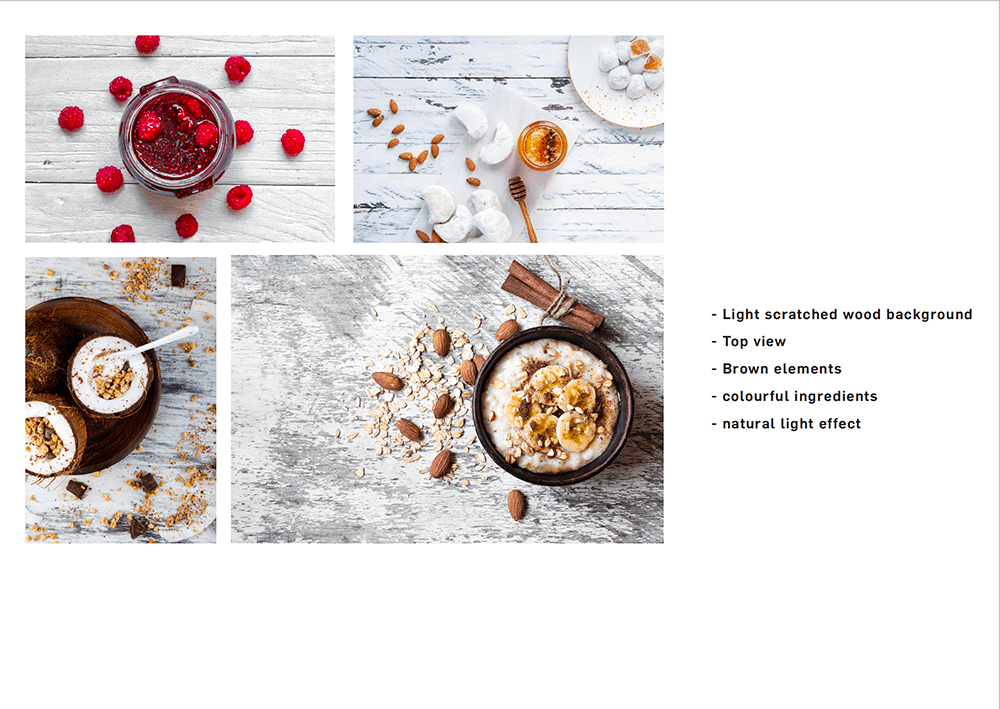
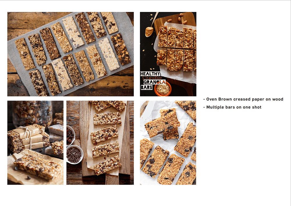
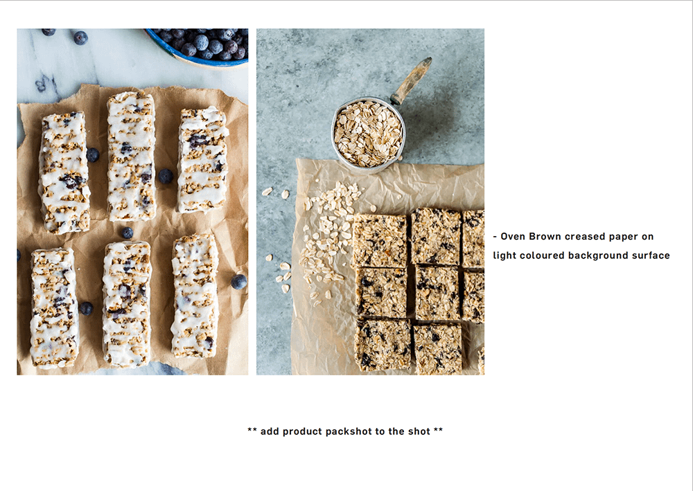
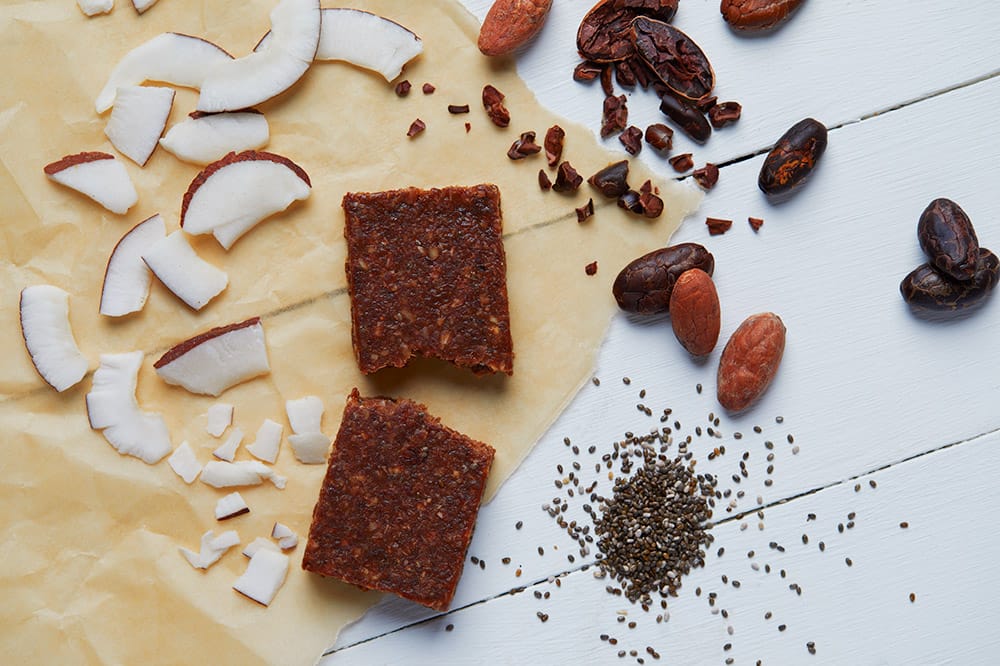
Once the development was proceeding I worked with the client to create the content for the website. Even more, using the knowledge gathered above about users and the new brand guidelines, I guided the photo shooting for the products.
” …using the knowledge gathered above about users and the new brand guidelines, I guided the photo shooting for the products.”
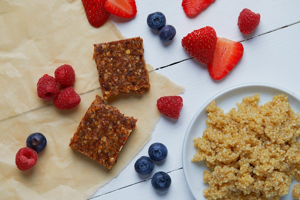
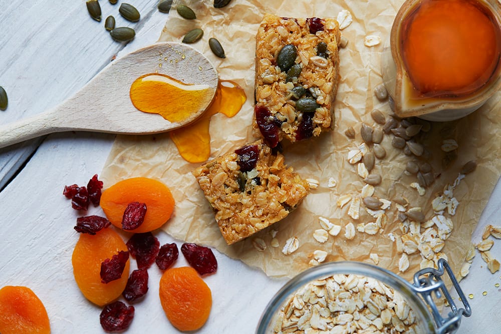
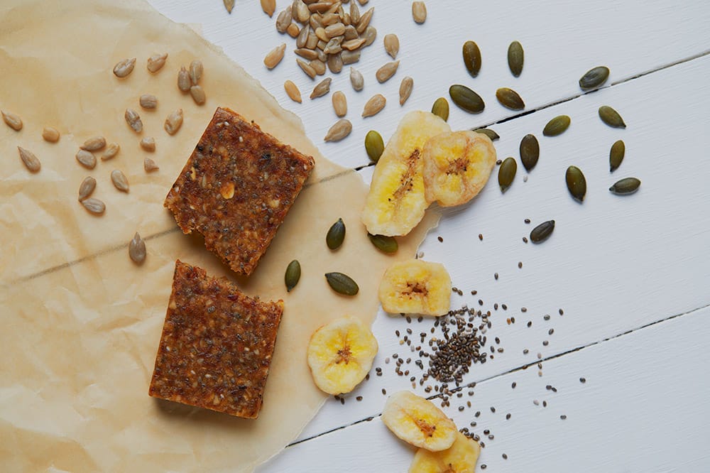
Final Lifestyle Shoots
When the product was fully built, and all the content was ready and uploaded, I organised a final full functionality testing and user usability testing.
Once it was fully tested the site went live.
It was advertised by the business owner on one side and on the other side, a welcome email was designed to allow existing customers to transition to this new product.
Alongside going live I worked together with the account manager and the developer manager to create simple and comprehensive documentation and guide for the client, provided together with full training. These were provided in a pdf format supported by video snippets created with Loom.
Post Live Results
Since its launch, the site was able to increase the number of orders from returning customers by over 20%, and increase the customer amount from 50k to 65k.
The need for support in placing an order has been drastically reduced, and a good amount of great feedback has been given by customers.
The client reports that the time and complexity of managing his business has been reduced as well, thanks to easy access to the info he needs and full reliable integration with the fulfilment partner.
Related projects
Streamlined Complaint process
Share safety to save lives
Download client-ready custom presentations


