
NBC Sports
←BACK


![]() for just the key information follow the yellow text.
for just the key information follow the yellow text.
A new live portal and tool for NBC Sports International to share and promote their titles and create instantly a custom PDF presentation.
General Info
client name // NBC Sports
starting year // 2018
role // Lead Product Designer
responsibilities // Overseeing the full product lifecycle from discovery to live. Hands-on work in discovery and design phase and leading work on testing and development planning.
Constraint & timeline
Because the project started has a proposal from our team we didn’t have an original timeline, however we knew that there wasn’t a budget in place so the solution presented had to be great to make them create a budget.
Client
NBC Sports is an American programming division of the broadcast network NBC, owned and operated by NBC Sports Group division of NBCUniversal and subsidiary of Comcast, that is responsible for sports broadcasts on the network, and its dedicated national sports cable channels.
Brief
NBC Sports INTERNATIONAL had an existing online portal to preview available titles and then select them to create a PDF presentation to be used as sales material. This existing solution was un-used due to the complexity of the website itself.
The client needed an updated, simple and modern public portal to be their first impression to clients willing to buy NBC Sports titles and also a tool for sales representatives to download PDF ready-presentations with requested titles.
Plan
Because this website started as a proposal to NBC SPORTS (an existing client) I did not have initial deadlines.
Starting from the understanding I decided to first study properly the current website (both qualitative review and analytics research) to get as much information as possible from the client and to run internal usability testing to highlight issues.
This phase would have been followed by an initial project proposal to the client, and then, if the client was going to accept, a full discovery phase, followed by a prototype and then development. ( I generally plan the discovery phase in details and largely the other phases at this stage)
Discovery
To create a solution I always start from the why so from understanding the key areas as much as I can. I do this at the beginning of every project during the discovery phase.
Discovery / initial discovery
To define a solution I had to understand the problems related to the existing site first. I did a qualitative review of it and together with a review of the analytics, I was then able to define tasks for internal usability testings.
Qualitative review results:
- Excess of pages
- Difficult to gather information
- Lack of clarity on the purpose
- Dated UI
Analytics showed little to no-usage. This was then confirmed by the client, the website was used by one person who was receiving the requests from the full sales team.
Even if the current website was mostly focused on showing the available titles, thanks to the client, I understood that the main purpose of the current website was to create a custom presentation to be used as sales material.
The internal usability testing was done by defining a specific task (based on the purpose of the website). It did confirm the qualitative review discoveries and also highlighted stress in checking titles before to go to the page dedicated to selection and download (of the custom presentation).
/ initial discovery results /
- I highlighted the main target to be NBC SPORTS sales representatives (and the secondary target was NBC Sports existing and potential clients)
- I highlighted and validated the main issues of the current website with a guide to design the new solution
- I defined a need for a solution
- Using the results from the first discovery we got approval from the client to start designing an updated version of the website
Discovery / post client approval
To proceed in building a full understanding I started on defining a high-level goal to achieve for this web-tool. To convert internal staff and external users to use this tool I started my research by understanding the reasons why the existing tool wasn’t adopted. Starting from the results of the first discovery I was also able to speak with the only adopter of the online tool that used to download the requested presentations for every member of the staff.
All these elements, together with a JTBD allowed me to define the main tasks for the user ( with their hierarchy and flow ) and then a website structure in the form of a mobile-first wireframe.
/ research /
To better understand the reasons behind the issues of the current solution ( and so be able to innovate and improve) I researched and reviewed similar tools on the market, either better or worse than the existing one. I reviewed tools that allowed me to download custom media, tools that allowed to review/buy video content (such as Amazon Prime and Netflix).
I then identified the strengths and the weaknesses of these tools, using the strengths as a starting point for the new solution. This was useful also considering that using methodologies that are familiar to people do help the tool to be adopted.
/ research results /
I identified that most of the existing tools allowed simple previewing of the title before the purchase. Not many web-tools that are focused on downloading a digital asset allowed to combine them, however, they all seemed to work as an e-commerce site does in terms of structure.
/ JTBD statement /
When I need to sell some titles from our catalogue I want to easily have them ready and in order so I can focus on the client.
/ main tasks /
The main tasks are connected to the JTBD and the previous knowledge gathered, they are:
- Show or share a selection of available titles (within the NBC sports catalogue)
- Browse and preview NBC Sports titles
- (Share title page link)
/ main user flow /

Discovery / wireframe
Considering the knowledge gathered in the first discovery, the research, the target analysis, JTBD, the main task hierarchy and the main user flow I have created the first wireframe structure with the main functionalities of the webtool.
/ wireframe description /
To solve the issue of the original website I focused on the main purpose of the website, creating a custom presentation. To simplify this function I reduce the webtool into 1 main page and just extra title pages.


Because sometimes clients might find difficult to understand the value of a wireframe I have presented the first version of it with all the main functions (either existing on the live website or new and useful) with basic branding applied, this helped focusing on the functions and the structure without having to think about general UI.
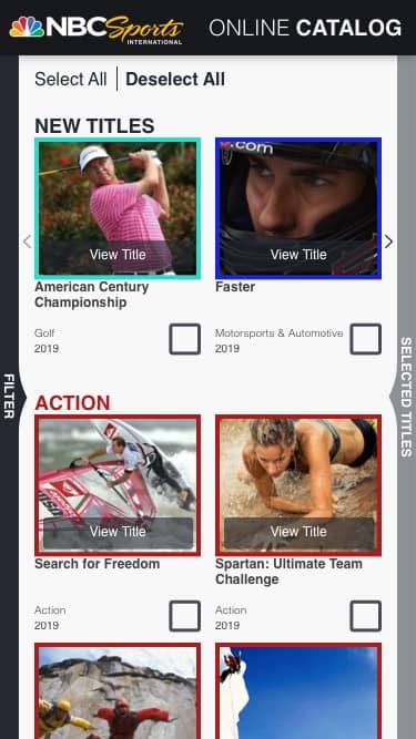

As this website had to work in a similar way of an e-commerce website with a PDF downloading as an ending point I structured it mainly like one. I introduced a section for filtering and a section for selected titles (like a basket) with options not only to download the selection in a PDF presentation but also to share it directly via email to multiple contacts. On top of this, the titles had a quick preview option for the user to check the title itself being sure of not losing the existing selection.
This structure was designed to clarify the main purpose by making it explicit, and reduce the number of unuseful pages.
The wireframe was then tested internally, once a few improvements were made it was shared with the client, that did his testing and reviewed with the project stakeholders. Because we clarified that the focus was on functionalities and structure, the wireframes was successfully signed-off with minimal feedback.
Prototype
Even if we clarified that the focus of the wireframe was on structure and functionalities, we did receive some initial requests for the UI, they can be summarised in the will of making the webtool, exciting and dynamic to reflect the sport’s soul of the brand.
The aim was creating a tool that was functional, effective and simple and, at the same time, visually appealing and engaging to be used not only from internal staff but also available to the public, and so designed to be then adopted as a tool by everyone.
I was able to create a concept with all the main features that were going to simplify and improve effectiveness and usability, and then by simplifying and applying the latest web design trends to the product, I achieve a solution that exceeded in all aspect client’s requests and solved effectively the main challenge.
In particular, I reduced the website UI to the main features by cleaning up and hiding the extra functions, such as the filter, and I also used light colours from the NBC Sports branding that together with overlapping elements created an interesting and dynamic experience.
On top of this, the whole platform was designed mobile-first, this helped in making the main UI decisions considering the main supported devices and also it helped in reducing and simplifying the whole solution, so the user, that will work with the platform, will have fewer obstacles and he will probably become a recurring user.


The prototype was also tested and checked together with a development manager, to make sure that the solution was in line with times, budget and expertise required for development, before it was presented to the client.
/ personalisation /
The solution has been designed taking in consideration personalisation. The top section allows the business to either push specific titles or to show to the user relevant titles depending on the titles he saw or downloaded. Furthermore, because they now take users’ emails for both downloading and sharing, they will be able to create marketing emails with titles that are relevant to the user to both simplify the user experience and to improve sales.
The prototype was presented using an animated video with both desktop and mobile, this helped also to go through the micro-interactions of the webtool. I used a clickable prototype for client internal and user testing to validate our product and make any adjustments before starting front-end development.
Development
Once the prototype was tested and approved I worked closely with the front-end developers. I first used the prototypes and the sketch file to provide them with a full picture of the structure and the requirements. During the build, I help them find solutions and make adjustments when needed.
Once the front-end was fully tested on desktop, tablet and mobile, on the supported browser and devices, we handed it to the client to run an internal user testing before starting developing the back-end, to make sure that we were still on the right path. Once we got sign-off for the front-end, I again worked closely with the development team to make sure that all the functionalities were built according to specs and to help find solutions to any possible issue that might have occurred.
Once the full tool was ready set-up and ran full testing on every device and browser supported. We then handed the product to the client together with full training of the cms and the analytics tools.
Live
The website went live in August 2019, since then, I monitored the analytics, together with any feedback coming from client internal users.
Post live
In February, 7 months after going live, I ran full testing of the website, to discover any bugs, together with a new user usability testing. These, together with the results from the analytics, allowed me to identify a few areas of improvement, such as the basket, the navigation and the multi-selection. A few solutions are currently being developed, after client approval, to address them.

” …allowed me to identify a few areas of improvement, such as the basket... “
Related projects
")
Streamlined Complaint process
")
Share safety to save lives
")
Fully automated Ecommerce
