LGSCO
←BACK


A 7 phases project to simplify the citizen’s experience in complaining about a public authority. A tailored form (for both user and organisation), two different faces of the same workflow fully integrated between them.
General Info
client name // Local Government and Social Care Ombudsman
starting year // end 2019
delivery year // 2020 – 2021
role // Lead Product Designer
responsibilities // Overseeing the full product lifecycle from discovery to live. Hands-on work in discovery and design phase and leading work on testing and development planning.
Constraint & Timeline
- Make the portal accessible to AAA WCAG 2.1 standards.
- The first phase to be delivered after 2 months of the starting date.
Client
The Local Government and Social Care Ombudsman, formerly the Local Government Ombudsman (LGO) is a service that investigates complaints from the public about councils and some other bodies providing public services in England. It also investigates complaints about registered adult social care providers. It is the last stage of the complaints process, for people who have given the council or provider opportunity to resolve the issue first. It is a free service.
Brief
Create a highly secure user portal that relates to the end-to-end complaint process, starting from the complaint form. The Portal will seamlessly integrate with the internal Complaints Management System (through APIs) to maintain existing working practises.
Plan
The project had already been divided into phases by the client, and the first phase was due to be delivered after just two months from the project starting date. So I decided to spend the initial two weeks to understand which one were the core areas of the future portal, the main goals, targets and outline biggest challenges.
With that understanding I was going to be able to plan the work properly and then set-up a full discovery and design phase.
This would have been followed by a build phase, quite blurred with the design phase due to the complexity of the form workflow (a core part of the site) and due to the required complex testing to validate the work. This process was then going to be reiterated for every phase.
Discovery
To create a solution I always start from the why so from understanding the key areas as much as I can. I do this at the beginning of every project during the discovery phase.
Discovery / key areas, goals and target
By mapping their existing process, which mostly relied on phone calls and manual input from agents, I understood the longest and most painful part of the complaint process (both for the agents and for the citizen) was providing and collecting all the user data. Because of this, I was able to identify in the complaint form the key area that would have given most of the value to the users and time back to the organisation.
This would have been the key area to develop in the MVP.
For these reasons, I worked closely with the stakeholders to understand the user flows on the form and the reasons behind each step (to understand if required because of existing processes, for technical reasons or just based on assumptions).
To understand better the form itself, and the decisions to be made to define a good flow, I worked with the stakeholders to define the goals for the portal, the target audience and the main reason for the user to be on their portal.
/ goals /
- Improve user experience in submitting and managing a complaint with LGSCO
- Streamline the workflow to gather complainant data and make them available to LGSCO internal complaint management system
- Reduce the number of support calls
/ target /
Every Citizen that couldn’t resolve an issue with organisations providing local public services
/ JTBD /
When the council didn’t decide correctly with an issue I raised I want to easily make things right so I can get my issue solved.
Discovery / project plan simplification
By working with the case workers and the users to define each required step of the form and the painful areas, I quickly realised the complexity of the workflow logics required to provide both clear user experience and correct and clean data to the organisation.
Because the first phase of the project was supposed to deliver a complete complaint form and a new full UI, due to lack of time to do quality work, I decided to propose two options:
- To merge phase 1 and 2, so moving the live date in the future but still working on both phases (so saving time in going live with an extra phase)
- To focus the first phase only on producing a robust complaint form to work as the ground level for the other phases to follow, with just basic UI and so minimal front-end work required. This was allowing to have the right time to design, test and build a process to gather data from the complainants and send them in the right order to LGSCO
The stakeholders supported my proposal, also because I was working closely with them to define the form. So I started to focus my attention on the form flow and logics, always keeping in mind the wider goal.
Discovery / complaint form
To define form logics I reviewed LGSCO internal practices, user common behaviours (gathering data from LGSCO user requests data and experience, as well as by working with their beta tester group).
I identified the sign-up flow to be the most complex part of the form in terms of related logic, due to a required pre-selection of users. Connected to that I also had to consider the complex data flow, especially in relation to handling sensible data.
Discovery / wireframe – prototype
Initially, to present and work on this form flow I used a flow map of the full process, and also some simplified flow maps for specific and selected areas, and later I used Axure to create an interactive prototype with the full logic. The flow map first and the Axure prototype later allowed me to do some initial usability testings.
” … to present and work on this form flow I used a flow map of the full process … “
” …and also some simplified flow maps for specific and selected areas … “
” …and later I used Axure to create an interactive prototype with the full logic… “
Because we decided with the developer manager to use a ready tool as a form base level, I used the map and the prototype to share the requirements and I worked together with him to complete the form flow directly on that tool.
I made this not only to simplify the process, because the form tool was easier to use than creating a prototype, but also to allow the form to generate real data (a key part and main purpose of the portal).
This approach, of merging the design and build, it’s not commonly used by me and actually I am usually against it, but in this case, due to what I explained before, it appeared to be the best option for this phase.
” …we decided to use a ready tool as a form base level, I used to complete the form flow directly on that tool… “
To help everyone in the team to work on the form I also created a few simplified site maps with some user flow elements.
” …To help everyone in the team to work on the form I also created a few simplified site maps with some user flow elements... “
/ first usability testing /
Once a complete version of the first iteration of the form was ready, I use that to do a first user usability test, with a small internal group of 20 people, by providing them with a few simple tasks and basic background:
[ background : This is a form to complain about local authorities. ]
The task to complete are:
- Create an account
- Submit a complaint
- Preview that complaint you have just submitted
This test highlighted a few issues in the flow that made the process unclear to the user (even if correct from the organisation point of view). Thanks to those data I was able to adjust the flow by adding the needed steps to make the form accessible.
/ client testing /
When the form structure was working as expected I worked with the stakeholders to organise an internal user testing with the client team. This allowed me to get some data from a wider usability test group at first and then valuable feedback on any odd and unexpected behaviour of the form.
First Release / Value delivered with phase 1 – form
- Agents manual work drastically reduced
-
Wrong details in complaint reduced to only those related to user error
-
No more duplicate complaints
-
Drastically reduced calls for updates
Discovery / full portal structure – phase 2
While the client internal testing was being done, I started to work with the stakeholders to define requirements for the full portal functionalities.
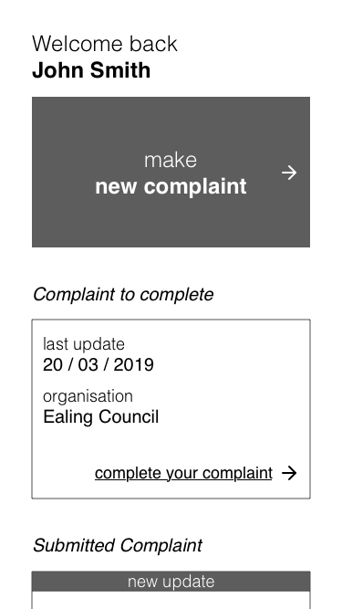
I used the initial requirements provided by the client to create a basic and plain wireframe to be used a starting point. Once the main functionality needed by the users and LGSCO had been defined I updated the wireframe to reflect them and do initial testing.
Prototype / UI – phase 2
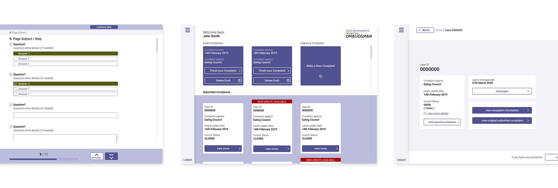
Once the wireframe was tested I started to create the full portal UI starting from the form.
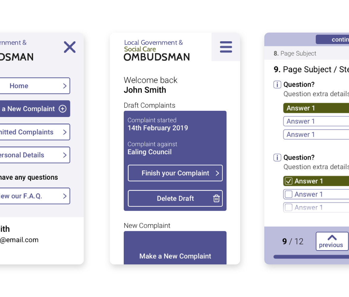
To begin I first analysed LGSCO branding to define colours (with the correct contrast) and their hierarchy of use. This then allowed me to define the basic common elements of the portal, such as buttons, text and navigation.
With this ground level, I analysed every kind of questions present in the form, and I made the UI for each one of them following the best accessibility practises and considering the existing structure of the current tool used for the form.
After creating the form UI I moved to the other pages of the portal that allow the user to track complaint progress and to manage their account.
With the complete mock-up, I created a fully interactive prototype to be tested first internally and then by the client’s team. I also used some web tools to test the initial accessibility of the portal, and I also worked with an accessibility expert to improve grey areas.
After collecting and analysing key data from these testing I updated the prototype.
Front-end Development – phase 2
Once the Prototype was fully tested and approved by the stakeholders I worked closely with the front-end developers. I first used the prototypes and the sketch file to provide them with a full picture of the structure and the requirements as well as a simplified site map to guide them.
” …a simplified site map to guide them.... “
During the build, I help them find solutions and make adjustments when needed. When the front-end was fully completed I run again some WCAG tests on it. Some of them included keyboard navigation and navigation for blind users using voice over.
Back-end Development – phase 2
While the front-end work was in progress I worked together with the developer manager, the back-end developers and LGSCO partner agency (from their internal complaints management portal) to define and structure the APIs required for the user portal to work correctly.
This complex process required and generated some updates in the information architecture as well as the user experience.
Throughout the process I was responsible for coordinating the work, making sure the features were built according to specs as well as responsible for QA.
Discovery – phases 3 to 6
Because the first two phases had now a clear structure I organised a face-to-face discovery workshop with the stakeholders to define more in detailed following phases. To do this I gathered information from previous phases, to give an overview of the ground level for the following one, as well as goals and target information.
I then created a flow chart with all the info gathered for each phase at the time and I used that as a guide during the workshop.
” …I then created a flow chart with all the info gathered for each phase at the time and I used that as a guide during the workshop.... “
During the workshop I used a whiteboard and post-its, guided debates and some Design Sprint exercises, to define, together with the stakeholders, key elements of each phase, considering:
- Where did the need come from (so a strong reason to have that functionality)
- Why was the portal the best place to house that functionality
- The characteristic of the functionality
- The possible challenges of the functionality (written in the How Might We format by the workshop participants during the workshop)
I then translated all the workshop into a virtual whiteboard using mural ( this also allowed me to easily continue the discovery process remotely ).
” …I then translated all the workshop into a virtual whiteboard using mural ... “
Prototyping / Messaging – phase 3
Once the full portal was live, and we were gathering usage data, I moved to other supporting areas, in particular, I focused on identifying the most appropriate way to reduce even more the number of calls and overall unnecessary communications.
By mapping the communications I identified the need for a messaging section, to replace existing email communications and also provide automated messages with useful information to guide the citizens with existing open complaints.
This section had to be directly connected to the case, because every complaint had a different case worker, and to meet the mental model of the users, that were navigating the platform in a case-centric way.
The work on the messaging section included:
- Defining how to structure it to be fully accessible while allowing case workers to send messages directly through their existing internal platform or emails and keeping existing templates. This also meant simplifying the stylings allowed and understanding how to send the message
- Understand how to handle attachments, not only in terms of size and format but also in relation to the accessibility of the content and the extra info needed to support the information in the attachment
- Define complaint stages and how to retrieve them
- Define automated guiding messages and connected useful links depending on the stage
- Define stages when the messages were monitored and vice versa to display the right info to the user
- Define stages when the user was allowed to send messages
To work on this, using the initial requirements from the discovery, the existing wireframe and the design system of the previous phases, I created an initial prototype. With that, through user testing and testing with the internal team of Case Workers, we defined the structure for the MVP with just the key features, for both the messaging section and the text editor within, being always aware of the areas to validate post-release.
Development / Messaging – phase 3
As in previous phases, I worked closely with the developers to create and test the front-end and structure the backend logic.
The biggest challenges during the build phase were related to:
/Front-end/
-
- Mobile handling of the keyboard on different devices and browsers
- Handling of text styles, in relation to accessibility
- Handling of attachments
- How to handle a large amount of messages while keeping the page quick
/Back-end/
-
- Handling of attachments
- Handling of sending and retrieving messages, considering no data was stored in the platform but all were retrieved from the internal LGSCO system
- Handling the different stages of the complaint to display relevant data and messages
Final value delivered
A first version of the full portal went live for the beta group at the beginning of 2021 and the full portal went live to all users in 2022.
This project provide value to both the citizen and the organisation:
-
85% of total users going through digital channel (over 30k total annual active users)
-
Improved overall citizen experience
-
Agents manual work drastically reduced
-
Wrong details in complaint reduced to only those related to user error
-
No more duplicate complaints
-
Drastically reduced calls for updates
Related projects
Download client-ready custom presentations
Share safety to save lives
Fully automated Ecommerce


