NBC UNIVERSAL
←BACK


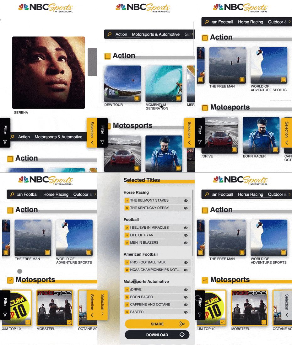
A B2B portal and tool for NBC Universal to share info and sell their movies to clients (like streaming services from Apple, Netflix and Amazon) through a web-based portal used by marketing managers from both sides to gather info and instantly create custom PDF presentations.
General Info
client name // NBC Universal
starting year // 2020
delivery year // 2021
role // Lead Product Designer
responsibilities // Overseeing the full product lifecycle from discovery to live. Hands-on work in discovery and design phases and leading work on testing and development planning.
Constraint & Timeline
- Improve over existing product
- Align new product to other NBC B2B platforms
Client
NBC Universal is one of the world’s leading media and entertainment companies in the development, production, and marketing of entertainment, news and information to a global audience.
The company is named for its two most significant divisions, the National Broadcasting Company (NBC) – one of the United States’ Big Three television networks – and the major Hollywood film studio Universal Pictures.
This product is for the Universal Pictures division who manages and sells Movies.
Brief
NBC Universal had a legacy tool with us that was outdated and wasn’t performing anymore.
The original brief was to simply re-skin the old product to align it to other NBC Universal tools. However, after the initial discovery, I identified a much bigger need that changed the brief from a re-skin to a full redesign based on the learnings of the existing product and the needs of its users.
Initial Plan
From the initial brief of reskinning the existing product, I started the design process from the discovery to understand user types, their needs and goal, and the connected flows. Then I used that to do a qualitative evaluation of the current site, to find discrepancies with the users and business goals.
After the first evaluation, I was able to clarify the scope from a reskin to a redesign.
From the initial information gathered and the connected requirements, my plan was to:
- Complete user understanding
- Define project goals
- Analyse current product
- Structure the updated version of the site
- Test the initial wireframe with key users
- Define the main building blocks (to maintain visual consistency with other NBCU products)
- Create UI in order following the user flows and pages hierarchy
- Create a prototype aligned to other NBCU product
- Test prototype internally
- Test prototype with respective users groups
- Start development from front-end to back-end.
Discovery
To create a solution I always start from the why so from understanding the key areas as much as I can. I do this at the beginning of every project during the discovery phase.
To get a proper picture of the requirements for this website I started by understanding and defining the main goals, and the key metrics to track.
Discovery / user research
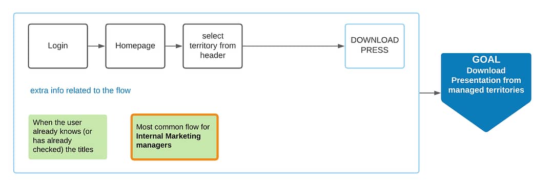
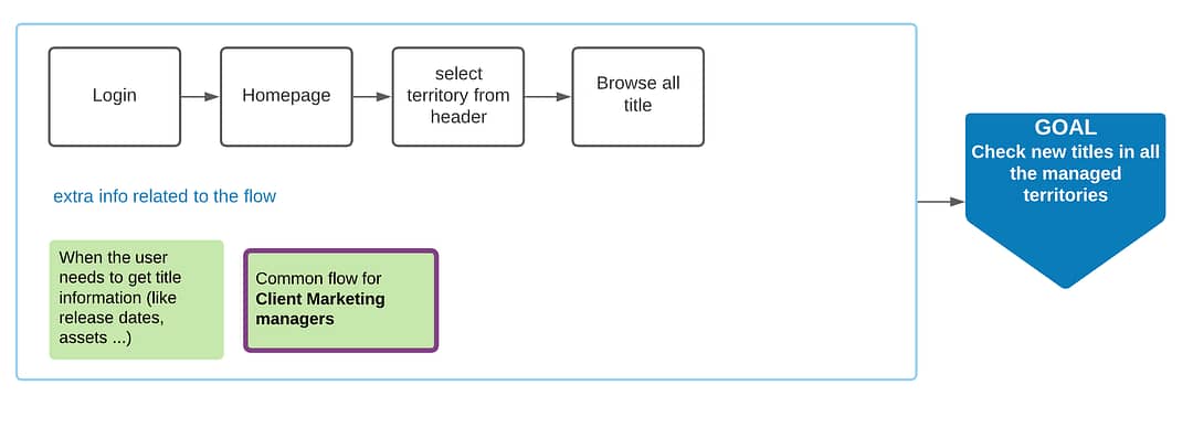
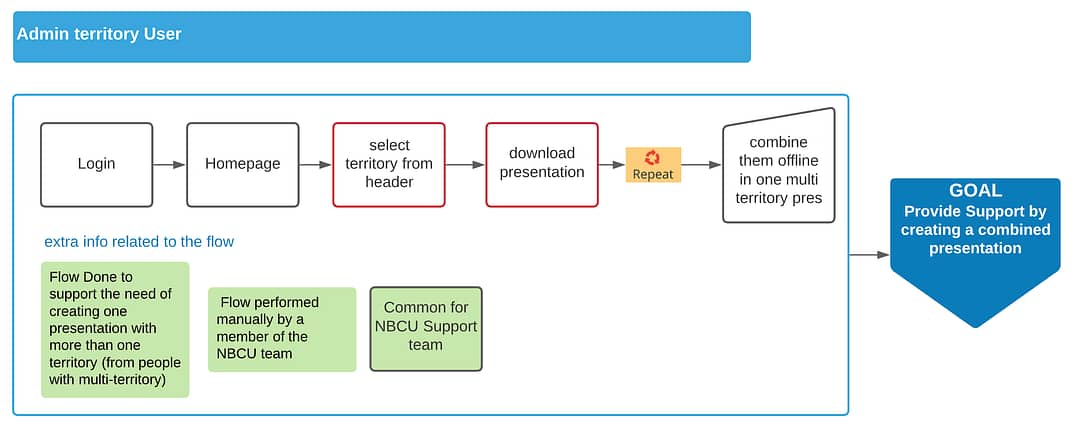
To gather the learning from the existing solution I structured a series of workshops with the key stakeholders to define users types, their needs and goals and their current flows.
I started by defining the current user types, then from those, using existing analytics, I worked with the client to identify the largest user group and their characteristics.
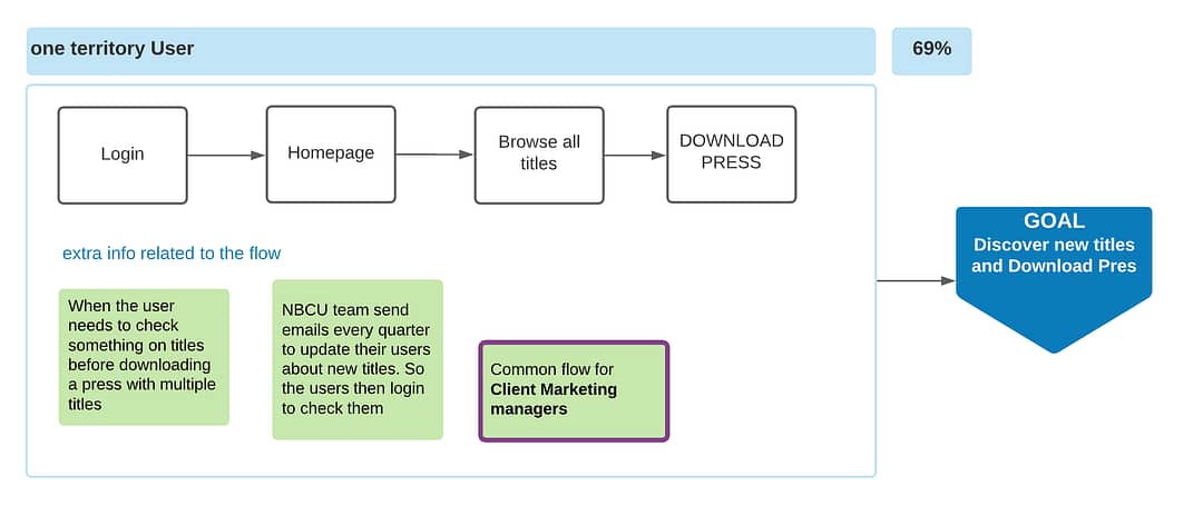
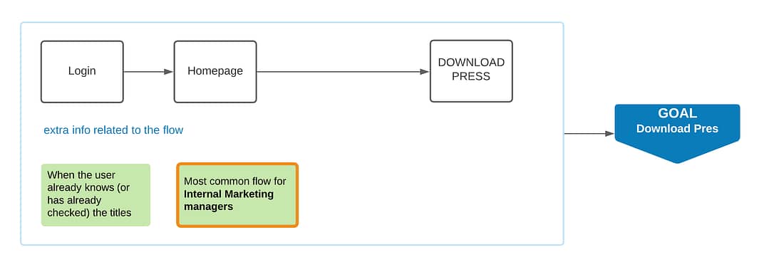
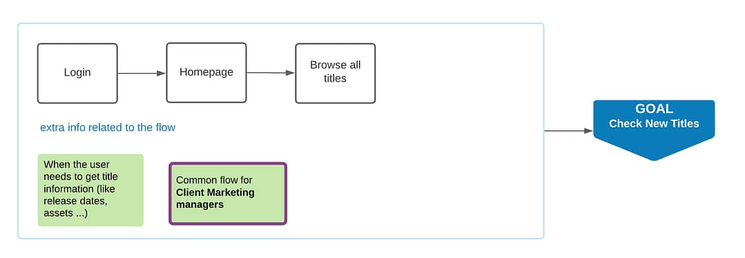
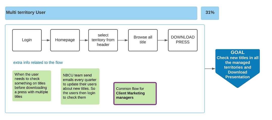
From there, I defined their needs and goals through flow mapping. I continued this process for every user type. The result of this work was a clear map with users types, the starting need, the flow they do to achieve their connected goal as well as the creation of the connected personas for each user type.
Through the process, working on the current user flows, I was able to identify the main problems in the current flow, using stakeholders and users feedback as insights validated by an initial heuristic analysis.
/ Current product user flows /
I identified 3 key users flow for each user type. From the feedback gathered I was able to associate each flow to its connected persona.
/ Main Users /
- Client Marketing Manager
- Internal Marketing Manager
/ Extra Users /
- Support team in NBCU
- Account managers in NBCU team
- Support team in Maglabs
Discovery / Analytics review and Heuristic Analysis
/ Analytics review /
To gather more learnings from the current solutions and to validate the key problems identified I analysed the existing analytics.
/ Learnings from analytics /
- Over 50% of users from UK
- 90% use English language
- 35% of users visited the homepage
- Users who go homepage spend an avg of 44s
- 10% of users visited a 404 page
- less than 1% used the search function and 9 out of 10 found no-results
- 13% of users didn’t visit the homepage because they landed there
- over 70% of users leave the site after visiting the download page
- Users visit almost equally ‘browse all titles’ and ‘download presentation’
- over 97% of users access from Desktop
- 65% of users use windows
- 90% of users from Chrome
/ Heuristics analysis results /
Using the knowledge gathered I evaluated the existing product to check if it was supporting the user and business’ goals. From these, I mapped out the results from area to area highlighting elements that supported those goals as well as elements that acted as a block to those goals, diving them in key to fixing and extra.
- The user has no guide on what to do after he logs in – the product is not easily learnable
- No Button hierarchy
- No page hierarchy
- Pages contain elements that can’t be used in that context
- Multi-territory users don’t have a clear flow of actions
- The main feature is hidden
- Site navigation is unclear
- UI is not responsive
- Homepage doesn’t provide any value
- Pages load slowly
- Title navigation is inconsistent
- Action connected to the main user goal is disconnected from information (download page is disconnected from title page)
- The search function is decontextualised and it doesn’t explain clearly how to be used
- Download presentation page has no structure and it’s unclear how to use it
Discovery / Personas

Paul
[Client Marketing Manager]
Age // 50
Gender // male
User type // Marketing Manager at Sony – UK & Canada
Pain Points //
Paul has limited time to get the info he needs to choose the titles to buy for this quarter
Needs //
Paul needs to know all the new available titles.
Paul needs a list with info of the titles he is or might be interested.
JTBD //
When I check the new titles from NBC I want to find what I need and save what I am interested in so I can speed up and simplify my job

Laura
[Internal Marketing Manager]
Age // 27
Gender // female
User type // NBCU Marketing Manager at Sony – France & Belgium
Pain Points //
Laura manages different clients in more than one territory.
Laura has a complex job and so limited time.
Needs //
Laura needs to share and sell new titles every quarter to his clients.
Laura needs to present titles with many information (images and text) from NBCU catalogue in a nice format to her clients.
JTBD //
When new titles are released every quarter I want to have all the info I need ready to be shared with the clients I manage so I can have more time to focus in selling the titles and making the client happy

Joel
[Admin]
Age // 32
Gender // male
User type // NBCU Support and content team
Pain Points //
Outside his normal responsibility, Joel has to help users who are struggling.
Joel manages users and content on the NBCU portal.
Needs //
Joel needs to receive fewer support requests.
Joel needs an easier way to add and manage users and content on the NBCU portal.
JTBD //
When someone is using the site for the first time I want to allow him to easily use the product without my help so I can have more time doing my main job
Discovery / Project Goals
These elements then allowed me to clarify the high-level goals for the project.
/ Project goals /
- Improve and simplify experience
- Simplify workflow for multi-territory users
- Align UI to other NBCU digital solutions
Discovery / wireframe
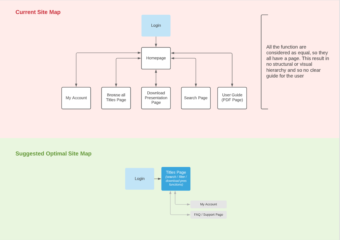
/ Optimal user flow and site map /
With a full map of goals, needs and problems I was able to define and propose an initial version of the optimal user flow and site map for the updated product.
The key drives were simplification towards a strong main flow useful for every user type and clarification of the site structure and purpose.
” …I was able to define and propose an initial version of the optimal user flow..”
” …I was able to define and propose an initial version of the site map for the updated product..”
/ Wireframe and first usability testing /
Once the approach and strategy were agreed upon with the stakeholders and the map of the structure of the new product was defined, I was able to create the first wireframe.
This wireframe covered all the main areas (excluding any basic section, like the member area). It was first used to guide discussions that allowed me to define the key elements with the stakeholders, and later it was used for the first usability testing, which was conducted with 1 representative from each user type group.
During this process, the user types evolved to a structure that better-supported business and user’s goals. This meant that now every user was a multi-territory user to provide flexibility and visibility to every title to every user.
With a tested structure, I was able to move to prototype.
” …I was able to create the first wireframe.”
Prototype / UI
Once the wireframe was tested I started to create the full UI starting from mobile.
To start I first gathered all the key elements from other NBCU products which I used to structure the main building blocks of the new UI.
With these, I started to build the UI following the flow hierarchy and the connected page hierarchy.
Because the multi-territory flow was the most complete, and the other two user type flows were just a simplification of the first one, I focused mainly on this.
Once I had the first version of the prototype, to help the stakeholders to decide what to do immediately and what to do later to stay within budget and deadlines, I created a spreadsheet where I divided each feature into 3 groups: key, supporting and extra.
With the first version of the prototype, I organise first an internal usability testing and then with an improved version, I structured another usability testing with 3 users from each user group.
The results of these were then used to create an updated and final version of the prototype that was then signed off by the client and prepared for development.

Development
With a clear structure, a defined UI, interactive prototypes, and comprehensive data flow and user flow, I started to work closely with the engineers. Thanks to these resources, the product was clear, and everyone knew exactly what to do.
During the build, I use my full understanding of the product, and my technical understanding, to support the developers to find solutions and make adjustments when needed.
Front-end
The Build started from the desktop front-end development. During this, I helped by providing detailed and specific material (like existing prototypes for specific pages, flows, micro-interaction animations etc.) and by testing the solutions during the building process.
Once the fully-responsive front-end was completed, I organised and also took part in the full testing on every supported device and browser. When all the feedback from this was implemented, I simultaneously ran a user usability testing, providing a specific task to the users (for both user and admin side), and provided the front-end to the client to test (and show progresses).
Back-end
With the front-end completed, I again worked closely with the developers in building the back-end to make sure that all the functionalities were built according to specs, providing specific user and data flow when needed as well as helping them finding solutions where any agreed flow or functionality wasn’t working as expected of fully feasible to build.
As I did for the front-end development, here as well I organised and ran testing throughout the back-end development and final testing on all devices and browsers.
Extra info
After my work on this project was done, the Lead of the project on the NBC Universal side, left on my LinkedIn profile the following review.
”
(Creative Services Manager – International Digital Distribution)
Related projects
Streamlined Complaint process
Share safety to save lives
Download client-ready custom presentations
